We all know that feeling: some time after we launch a site, new designers and developers come in and make adjustments. They add styles that don’t fit with the content, use typefaces that make us cringe, or chuck in bloated code. But if we didn’t leave behind any documentation, we can’t really blame them for messing up our hard work.
To counter this problem, graphic designers are often commissioned to produce style guides as part of a rebranding project. A style guide provides details such as how much white space should surround a logo, which typefaces and colours a brand uses, along with when and where it is appropriate to use them.
Design guidelines
Some design guidelines focus on visual branding and identity. The UK National Health Service (NHS) refer to theirs as “brand guidelinesâ€. They help any designer create something such as a trustworthy leaflet for an NHS doctor’s surgery. Similarly, Transport for London’s “design standards†ensure the correct logos and typefaces are used in communications, and that they comply with the Disability Discrimination Act.
Some guidelines go further, encompassing a whole experience, from the visual branding to the messaging, and the icon sets used. The BBC calls its guidelines a “Global Experience Language†or GEL. It’s essential for maintaining coherence across multiple sites under the same BBC brand.

The BBC’s Global Experience Language.
Design guidelines may be brief and loose to promote creativity, like Mozilla’s “brand toolkitâ€, or be precise and run to many pages to encourage greater conformity, such as Apple’s “Human Interface Guidelinesâ€.
Whatever name or form they’re given, documenting reusable styles is invaluable when maintaining a brand identity over time, particularly when more than one person (who may not be a designer) is producing material.
Code standards documents
We can make a similar argument for code. For example, in open source projects, where hundreds of developers are submitting code, it makes sense to set some standards. Drupal and Wordpress have written standards that make editing code less confusing for users, and more maintainable for contributors.
Each community has nuances: Drupal requests that developers indent with two spaces, while Wordpress stipulates a tab. Whatever the rules, good code standards documents also explain why they make their recommendations.
The front-end developer’s style guide
Design style guides and code standards documents have been a successful way of ensuring brand and code consistency, but in between the code and the design examples, web-based style guides are emerging. These are maintained by front-end developers, and are more dynamic than visual design guidelines, documenting every component and its code on the site in one place.
Here are a few examples I’ve seen in the wild:
Natalie Downe’s pattern portfolio
Natalie created the pattern portfolio system while working at Clearleft. The phrase describes a single HTML page containing all the site’s components and styles that can act as a deliverable.
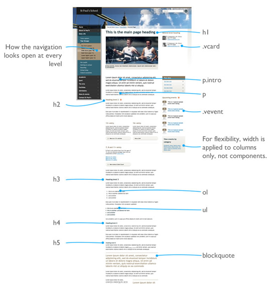
Pattern portfolio by Natalie Downe for St Paul’s School, kept up to date when new components are added. The entire page is about four times the length shown.
Each different item within a pattern portfolio is a building block or module. The components are decoupled from the layout, and linearized so they can slot into anywhere on a page.
The pattern portfolio expresses every component and layout structure in the smallest number of documents. It sets out how the markup and CSS should be, and is used to illustrate the project’s shared vocabulary.
Natalie Downe
By developing a system, rather than individual pages, the result is flexible when the client wants to add more pages later on.
Paul Lloyd’s style guide
Paul Lloyd has written an extremely comprehensive style guide for his site. Not only does it feature every plausible element, but it also explains in detail when it’s appropriate to use each one.
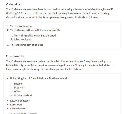
Paul’s style guide is also great educational material for people learning to write code.
Oli Studholme’s style guide
Even though Oli’s style guide is specific to his site, he’s written it as though it’s for someone else. It’s exhaustive and gives justifications for all his decisions. In some places, he links to browser bug tickets and makes recommendations for cross-browser compatibility.
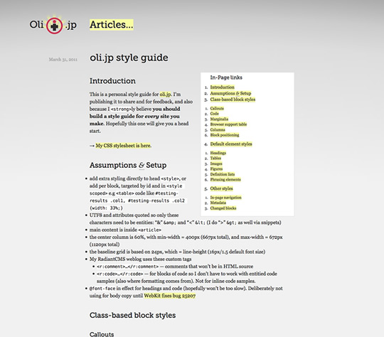
Oli has released his style guide under a Creative Commons Attribution Share-alike license, and encourages others to create their own versions.
Jeremy Keith’s pattern primer
Front-end style guides may have comments written in the code, annotations that appear on the page, or they may list components alongside their code, like Jeremy’s pattern primer.
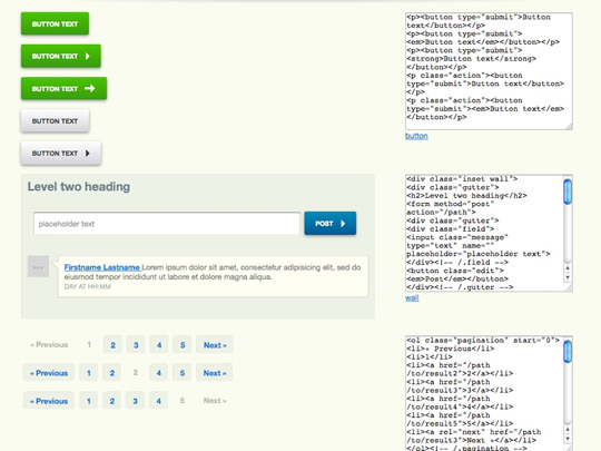
You can watch or fork Jeremy’s pattern primer on Github.
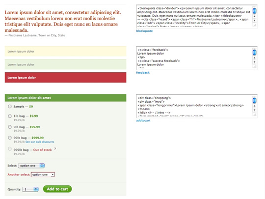
Linearizing components like this resembles a kind of mobile first approach to development, which Jeremy talks about on the 5by5 podcast: The Web Ahead 3.
The benefits of maintaining a front-end style guide
If you still need convincing that producing documentation like this for every project is worth the effort, here are a few nice side-effects to working this way:
Easier to test
A unified style guide makes it easier to spot where your design breaks. It’s simple to check how components adapt to different screen widths, test for browser bugs and develop print style sheets when everything is on the same page. When I worked with Natalie, she’d resize the browser window and bump the text size up and down during development to see if anything would break.
Better workflow
The approach also forces you to think how something works in relation to the whole site, rather than just a specific page, making it easier to add more pages later on. Starting development by creating a style guide makes a lot more sense than developing on a page-by-page basis.
Shared vocabulary
Natalie’s pattern portfolio in particular creates a shared vocabulary of names for components (teaser, global navigation, carousel…), so a team can refer to different regions of the site and have a shared understanding of its meaning.
Useful reference
A combined style guide also helps designers and writers to see the elements that will be incorporated in the site and, therefore, which need to be designed or populated. A boilerplate list of components for every project can act as a reminder of things that may get missed in the design, such as button states or error messages.
Creating your front-end style guide
As you’ve seen, there are plenty of variations on the web style guide. Which method is best depends on your project and workflow. Let’s say you want to show your content team how blockquotes and asides look, when it’s appropriate to use them, and how to create them within the CMS. In this case, a combination of Jeremy’s pattern primer and Paul’s descriptive style guide – with the styled component alongside a code snippet and a description of when to use it – may be ideal.
Start work on your style guide as soon as you can, preferably during the design stage:
Simply presenting flat image comps is by no means enough - it’s only the start… As layouts become more adaptable, flexible and context-specific, so individual components will become the focus of our design. It is therefore essential to get the foundational aspects of our designs right, and style guides allow us to do that.
Paul Lloyd on Style guides for the Web
- Print out the designs and label the unique elements and components
you’ll need to add to your style guide. Make a note of the purpose of
each component. While you’re doing this, identify the main colours used
for things like links, headings and buttons.
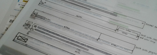 I
draw over the print-outs on to tracing paper so I can make more
annotations. Here, I’ve started annotating the widths from the
designer’s mockup so I can translate these into percentages.
 - Start developing your style guide with base styles that target core elements: headings, links, tables, blockquotes, ordered lists, unordered lists and forms. For these elements, you could maintain a standard document to reuse for every project.
- Next, add the components that override the base styles, like search boxes, breadcrumbs, feedback messages and blog comments. Include interaction styles, such as hover, focus and visited state on links, and hover, focus and active states on buttons.
- Now start adding layout and begin slotting the components into place. You may want to present each layout as a separate document, or you could have them all on the same page stacked beneath one another.
Document code practices
Code can look messy when people use different conventions, so note down a standard approach alongside your style guide. For example, Paul Stanton has documented how he writes CSS.
The gift wrapping
Presenting this documentation to your client may be a little overwhelming so, to be really helpful, create a simple page that links together all your files and explains what each of them do.
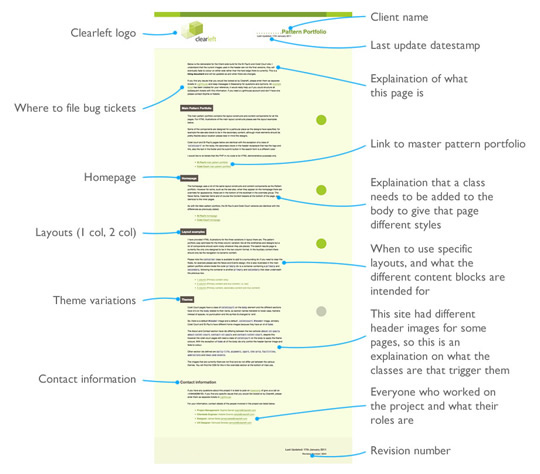
This is an example of a contents page that
Clearleft produce for their clients. They’ve added date stamps,
subversion revision numbers and written notes for each file.
Encourage participation
There’s always a risk that the person you’re writing the style guide for will ignore it completely, so make your documentation as user-friendly as possible. Justify why you do things a certain way to make it more approachable and encourage similar behaviour.
As always, good communication helps. Working with the designer to put together this document will improve the site. It’s often not practical for designers to provide a style for everything, so drafting a web style guide and asking for feedback gives designers a chance to make sure any default styles fit in.
If you work in a team with other developers, documenting your code and development decisions will not only be useful as a deliverable, but will also force you to think about why you do things a certain way.
Future-friendly
The roles of designer and developer are increasingly blurred, yet all too often we work in isolation. Working side-by-side with designers on web style guides can vastly improve the quality of our work, and the collaborative approach can spark discussions like “how would this work on a smaller screen?â€
Sometimes we can be so focused on getting the site ready and live, that we lose sight of what happens after it’s launched, and how it’s going to be maintained. A simple web style guide can make all the difference.
If you make your own style guide, I’d love to add it to my stash of examples so please share a link to it in the comments.

