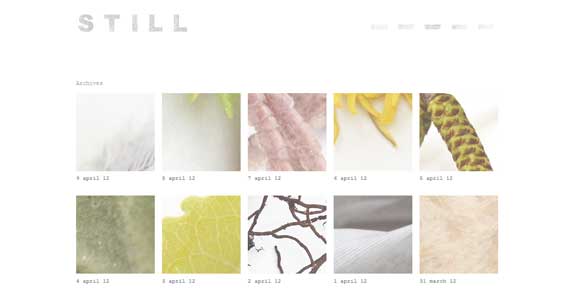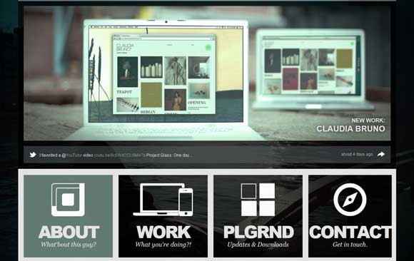
While the tools are out there for almost anyone to build a website, the most successful designs all share a few characteristics. These sites tend to be organized well, have great content and have all the design details in order.
Small parts of your site, from alignment and bolding to contrast and color, can make or break the design. Taking care of the details before your project is published will ensure the page has a clean overall feel. Unorganized design and lack of attention to detail can leave a site design looking unprofessional and even jarring. Before you start your next project think about all the little things and how they can pull your project together.
Alignment
One of the first keys to a clean design is vertical and horizontal alignment. Just dropping elements in random placements will not have the clean, consistent feel that is associated with some of the best, most professional looking sites. Proper alignment helps a site maintain hierarchy and consistency in design.
When working with images and text elements, note how things line up horizontally across the page. Do the tops of each item rest in a straight line? What about the bottoms of each element?
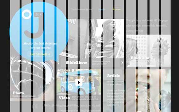
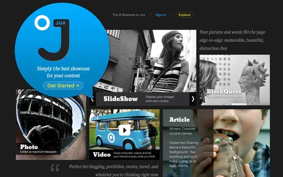
You also want to keep an eye on the vertical alignment. Keep the widths of elements consistent and pay special attention to the empty spaces between elements. The gutters (or space between elements) should be the same from element to element. Notice how nice photos of different widths fit on a grid on the Jux site. Gutters have consistent widths and photos of varying shapes align perfectly.
One of the quickest and simplest ways to keep your items aligned properly is to work with a grid as you design your site. There is no hard and fast rule for what type or size of grid will work best but using some sort of grid structure will help you build with alignment in mind.
Use the grid to place and size elements as you build. You can work with a grid that consists of evenly spaced vertical and horizontal squares (which resemble the old grid paper you used in geometry class) or you can use more of a columnar grid. You can create the grid yourself or download a premade template.
Contrast
Certain elements of your site will always garner more attention than others because of an image or color or text. Planning and using contrast effectively will ensure that you determine where the eye goes first. Establish contrasting elements in your design using color, text and varying weights. Determine where you will really want attention to go on the site and create the most contrast in that area.
One of the easiest ways to create contrast is through color. Once you have established background and text colors, use something totally different to add emphasis to a certain part of the site. Take note of the minimalist approach used by Doberman. The site relies on a basic (but clean and reliable) black and white color scheme but adds yellow color blocking for emphasis. The bright color directly contrasts with the stark nature of the underlying theme and immediately draws the eye. Further, the site designer added touches of blue for additional contrast in other key areas of the site.
You can also create contrast through a variety of other devices. Varying large and small font sizes or thick and thin typefaces also establish contrast and help develop a sense of hierarchy.
Type effects
Making type selections and decisions can be one of the toughest parts of creating a site from scratch. To keep your design clean, focus on a limited selection of fonts or font families. Too many typefaces can ruin even the most-detailed project.
Use variants within font families for variety. Different sizes, cases, weights and color can add variety and contrast without having to add additional fonts. As a general rule, most sites can be built using just two typeface families. Simple typography can help establish order and is easy to read.
When you are planning how to use each font, think about size and weight. Use the same font attributes for common items across the site. Use one font, case, size and color for headers. Use the same font but another size, color or weight for subheaders and use a third color or weight for bold or strong characters within the body text. Take notes that you can refer back to as you set the type attributes for different parts of the site so that type specs are consistent from page to page.
Color
In the same way using a limited number of typefaces can benefit design, a small color palette can do the same. Determine your color palette and note the color mixes for each swatch. Use the exact color mixes throughout the site. Red is not just red; even slight variances in your colors between elements can be very jarring.
Jot down all your color values as you build the site. For variances, use tints of each color for emphasis and added effect. Netlife Research, for example, does a great job of sticking to a consistent (mono)color palette using three tints of the same green throughout the site. Your palette does not have to be this simple but keep this principle in mind as you begin sketching a new design.
Consistency
The most key detail of all can be consistency. Across all elements on the site, maintain a look and feel. Logos, headers and banners should not look dramatically different from page to page. Use the same words in your navigation. Use the same or similar colors for common elements. Stick to your font palette. If you have a grid, use it.
Make sure all the small components of the site are complete. Leaving the little things for later can really hurt your site today. Make a checklist of things to be on the lookout for as you finish the design:
- Vertical object alignment.
- Horizontal object alignment.
- Contrasting elements for emphasis.
- Number of fonts.
- Consistent font sizes.
- Number of colors.
- Proper color mixes.
- Consistent elements such as headers and footers.
Image Credits: “Coloured Leaves†by pareeerica
Source: http://tympanus.net/codrops/2012/04/10/successful-web-design-its-all-about-the-details/
